Sunday, 11 October 2015

My Reflections about the works of 12 Photographers who I have chosen

My Reflections about the works of 12 Photographers who I have chosen

Ansel Adams – The grandfather of landscape photography. He is the one nature photographer that transcends the genre and even photography for that matter. His images are so well-known that photographers and tourists-alike are still trying to fill his tripod holes 60 – 70 years after his most famous images were made. Perhaps his greatest legacy were his environmental conservation efforts with the Sierra Club that led to creation of Sequoia and Kings Canyon National Parks among other areas, and also the art education institutions that he helped to create.

Reflection:
His works are outstandingly beautiful for BW. The resolution and the sharpness on the contrast and detail are amazing. I can feel the sensation and present of nature. It is just nice i can’t say a word to describe this.

His works:


Galen Rowell – A well-rounded photojournalist with a special ability to connect with a vast audience through his writings, Rowell influenced countless photographers in multiple genres beginning with rock climbing, wilderness adventure and then eventually landscape photography in the 2nd half of his career. The list of current working photographers that have followed in his footsteps reads like a who’s who in outdoor adventure and landscape photography and number too many to list. He was one of the first to utilize 35mm cameras exclusively in outdoor photography and popularized the use of graduated neutral-density filters.

Reflection:
His works are magnificent. With the colours of nature by their side, it looks stunning. It is like a human eye would picture.

His works:


William Henry Jackson – One of the early pioneers of landscape photography, Jackson’s photos were instrumental in the creation of the National Parks system beginning with Yellowstone National Park in 1872. Not to go unmentioned should be the fact that this was essentially the first of a long-tradition of using nature photography as a catalyst for environmental conservation efforts.

Reflection:
His works are like Ansel Adams' works. but his works are instrumental to national parks system. so he make history in the place. his work maybe a little boring but for standard is amazing.

His work:


Eliot Porter – In contrast with Ansel Adams’ big landscape style, Porter’s photos were more “quiet” and focused on the intimate landscape scenes that are easily overlooked. It is easy to overlook his body of work in favor of postcard views but one needs to only look at the photographers that he influenced to see that his work has left a lasting impact. Photographers including William Neill and Charlie Cramer have styles that bear a strong resemblance to Porter’s vision. His most famous body of work is arguably the book, In Wildness Is the Preservation of the World.

Reflection:
His works are about mother nature mostly. I am with his bird picture he captured. The Glen Canyon is marvelous. He did portrait but less than mother nature.

His works:


David Muench – Like Ansel Adams did with black and white landscape photography a generation prior, Muench is synonymous with color landscape photography. The now-cliche’d use of prominent foreground elements leading the eye through the frame to the background in the distance was a style that Muench became known for back in the 50’s and 60’s. You would walk into any library or bookstore in America in the past 40 years and be hard-pressed to not see his books or calendars even if you don’t know his name.

Reflection:
His Works are stunning. from the sunrise to sunset, his pictures are golden. Full of golden colour from the sunrise and sunset. It is hard to imagine the clouds on the mountains peaks, it is very good

His works:


Carleton Watkins – Created some of the earliest known images of Yosemite National Park which helped to spark interest in the western landscape.

Reflection:
His works are in form of sepia and BW. Either of that, I found it not bad but it is quiet different from Ansel Adams.

His works:


Philip Hyde – A top Sierra Club photographer in the 50 – 70’s, Hyde’s photography was instrumental in campaigns to save southwestern landscapes from flooding due to dams including the Grand Canyon and Dinosaur National Monument which led to the birth of the modern environmental movement. A number of leading nature photographers cite him as an inspiration for their life’s work.

Reflection:
His works are in colour and BW, but is still look marvelous. His works are kind of simple and easy but nice.

His works:


Robert Glenn Ketchum – He is arguably the most prominent conservation photographer working today. His photography is actively used to further environmental causes in the American political system. His aerial photography of Alaskan landscapes are especially stunning.

Reflection:
His works are easy to guess. mother nature of landscapes. From air to ground, and ground to ground
They are well pictured and nice, even lights can be seen just like what I see in real life.

His works:


John Shaw – The author of several best-selling nature photography how-to books he is often credited with helping beginning photographers to improve their photography and is still a leading figure in the workshop market today.

Reflection:
His works are about Mother nature: animals and landscapes. I think he could have been working for National Geographic. His works are very nice and well.

His works:


Arthur Morris – A sign of an influential photographer is one that is often imitated, and one would be hard-pressed to see any bird photography that doesn’t bear Morris’ influence. He is arguably the most prolific bird photographer of all-time and runs a successful birding workshop business.

Reflection:
His works are about birds and in every shots are focused. This is very well focused and amazing.

His works:


Donald "Don" McCullin, CBE Hon FRPS (9 October 1935) is an internationally known British photojournalist, particularly recognized for his war photography and images of urban strife. His career, which began in 1959, has specialised in examining the underside of society, and his photographs have depicted the unemployed, downtrodden and the impoverished.

Reflection:
His works and picture has story behind it. every works I saw are meaningful and I could see the story and how I imagined. Mostly are about humanity and suffering and hate

His works:


Lyle Owerko is a filmmaker and photographer whose work has ranged from Sundance Channel to Time to MTV. His photos are collected by many business, entertainment and celebrity clients, they have been used in several films including Henry Singer's The Falling Man and The Omen (2006 film), as well as books such as Jonathan Safran Foer's Extremely Loud and Incredibly Close. His work is also included in the permanent archive of the Library of Congress in Washington DC. Owerko travels extensively around the world each year shooting assignments and personal work. He resides in New York City.

Reflection:
His work are portraits. I can't understand what is the meaning of portraits but I am amaze about he took the 9/11 picture of WTC. I couldn't believe his bravery.

His works:


Mikhael Dave William
F14DM0477
Photography and Design 1
Thursday, 16 October 2014

3 artists in your field (graphic designers)

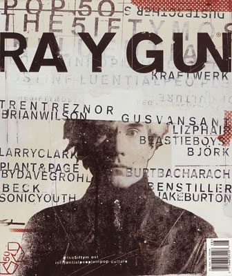
After I skimmed read the articles, in my opinion, breaking the rules are good unless you know the rules. graphics design is about high imagination type of art, where it is supposed to be freely designed and created. Like David Carson, he broke the rules of the grid system, which is about the vertical and horizontal lines because he ignored the vertical and horizontal planes completely, relying heavily on overlapping text, images and diagonal lines. This is called the Grudge Movement and his broken rules will be used in the future forward. Another artist called William Bernbach, whose art is simply but effective. lastly, Chip Kidd, who used caps lock for a title of a long and memorable, so people wouldn't forget and can't be ignored. These artists will help me in the future later on.

The Grid System

The grid system is a very popular method, taught in most basic graphic design classes since the 1970s. After World War II, designers Josef Müller-Brockmann, Emil Ruder and Max Bill started questioning the typical page layout style of the time. They felt that it was disorganized, so they began devising a flexible system of layout that was based on a series of lines that would guide a designer toward a balanced final design. The grid system recommends that all elements of the page be aligned with one another through a system of evenly spaced vertical and horizontal lines.
David Carson
The grid system can be a helpful starting point, but isn't always an effective tool for every layout. Some of the most revolutionary designers have ignored the grid system altogether. David Carson was one of the first designers to successfully disregard the grid system. He ignores the vertical and horizontal planes completely, relying heavily on overlapping text, images and diagonal lines. His innovative style defined the so-called "grunge" movement, and Graphic Design USA magazine named him one of the top five most influential designers of the current era. His ground-breaking indifference to the grid system shows that the breaking of rules can help fuel creative expansion.

White Space

White space, or negative space, is the area not occupied by page elements such as text, images and drawings. It can be used strategically to separate unlike items and group similar ones together. White space is not necessarily white, but rather empty space in general. Most design instructors will tell you that white space should be used in moderation, primarily as a tool to divide information. However, empty space draws attention to whatever it surrounds. If the goal of an advertisement is to bring attention to a product, the use of excessive white space can be a valuable asset in doing so.
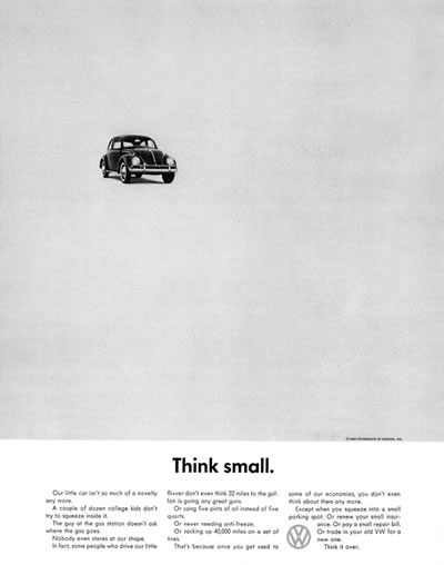
Volkswagon
William Bernbach, a famous twentieth-century advertising creative director, led a number of successful ad campaigns that exemplified this point. One of his campaigns for Volkswagon, called Think Small, consisted only of a petite image of a Volkswagon Beatle in the top left corner of the ad and a small block of text at the bottom of the page. This was meant to emphasize the car's simplicity, countering the typical information-heavy car advertisements of the time. The ad was considered effective, garnering much-needed attention and business for Volkswagon during a time when the company was still often associated with Nazi Germany. This shows that ignoring fundamental guidelines about white space can sometimes achieve positive results.

Symmetry

Perfectly centered compositions or those with mirror images are considered to have symmetrical balance. It is often taught that designers should avoid symmetric alignment in a layout. This may be true in certain circumstances. For example, a large block of text rarely looks good center justified. But there are many instances when a symmetrical balance can be an effective design technique.
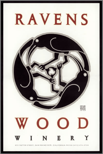
Ravenswood
David Lance Goines, an American designer and printing entrepreneur, is well known for creating symmetrical poster designs. The success of his work is due in large part to his center-aligned layouts, which relied heavily on symmetry. For Ravenswood Winery, one of his most well-known clients, he created a symmetrical wine bottle label consisting of a trio of ravens intertwined with one another. The layout feels almost hyper-balanced, giving it a memorable quality that would not be as effective without that line of symmetry running down the center of the piece.

Use No More Than Two Fonts

As a general rule, it is best to avoid using numerous fonts. The effectiveness of one typeface comes from its relationship with another, so when too many are used, it can detract from the overall success of the piece. But if you can understand why this rule exists, then it is possible to ignore it and create an appealing piece of design.
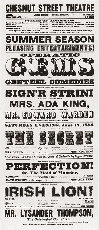
Woodtype
Nineteenth-century wood-type posters and playbills were known for displaying multiple typefaces within one composition. Many of these posters were successful despite breaking the rule, because the designers paid particular attention to the way each font interacted with the others. Similar proportions and colors gave the multi-font posters a sense of unity. Many contemporary designers still reference these classic designs in their work, and the era is heralded as an important time in the history of graphic design.

Pick Colors That Complement, Not Detract

Color theory studies show that complementary colors are the most appealing to the human eye, so most graphic design students are taught to limit their color palette to one or two complementary colors. But sometimes creating an eye-catching layout is more important than making an appealing one. Some of the best designs combine what are called "discordant" colors, creating a mix of colors so jarring people are drawn to it. Color should be used to emphasize importance, not to decorate the page. Using this logic, the quantity and hue should not matter as long as they are used effectively.
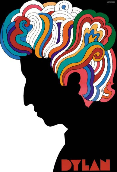
Milton Glaser
Legendary designer Milton Glaser has tended not to conform to the rule of using only a couple of complementary colors. His work is colorful, filled with uncomfortable combinations. His choices are so unusual that the viewer notices the layout, while it might otherwise be overlooked without those bold hues. In his renowned Bob Dylan poster, he pairs maroon, magenta and a host of other colors. Despite his disregard for traditional graphic design rules, he created a successful poster that perfectly represented both the man and the era. In fact, the piece was reportedly designed for a book jacket originally, using only blue and tan instead of the colorful version that everyone has come to know and love. Bob Dylan himself rejected that design. Years later, the same layout in all its glorious color was used on the now-famous poster. This proves how much of an effect discordant color can have.

Script in All Caps

Another common graphic design lesson is the advice to avoid capitalizing a whole line of text. Because the cap height of all the letters is the same, it is more difficult for the reader to decipher between each letter. The argument is that this makes the viewer less likely to bother to read the text at all. This is sound advice for long lines or entire blocks of text, but capitalization can be very effective in other instances.
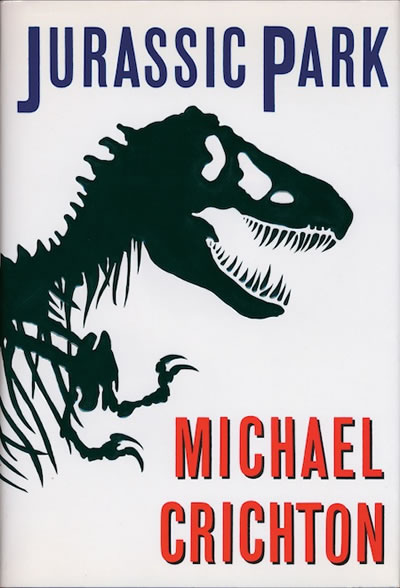
Jurassic Park
Uppercase words slow people down, and they are often perceived as visual emphasis. These are reasons that they can also be used to a designer's advantage. Famous book designer Chip Kidd favors the use of his "caps lock" key. He has designed recognizable covers for books such as Jurassic Park, No Country For Old Men and Possible Side Effects. In the case of a book jacket, using all caps to emphasize the title is an appropriate and advisable strategy. A memorable book deserves an accentuated title.

Conclusion

Many fundamental graphic design rules are built on solid foundations, and budding designers should follow these guidelines until they are familiar with the reasoning behind them. But just because they are called "rules" does not mean that they absolutely must be followed. In graphic design, "right" and "wrong" do not exist, because every single design problem is different. Using your aesthetic intuition to gauge whether your design is effective is more important than whether or not you have followed all the traditional guidelines. The next time you are inclined to assemble your layout in a grid, try jumping outside of the confines of those right angles… you may be happily surprised by the result.

Forced Connection Part 1 (Emotion + object)

Our lecturer showed us images of how emotions can be applied onto objects. I choose a computer mouse.

the passionate portrayed as computer mouse specialized for gamers
the sad portrayed as an ordinary computer mouse with pareidoilia of a sad face
the brave portrayed as a very high tech computer mouse that is used anytime and anywhere
the creative portrayed as a computer mat with 2 taps and a roller with a wireless connection usb
the greedy portrayed as computer mouse with a little space for the hand to place
the hardworking portrayed as computer with a multitasking accessories like a calculator and a tiny pen

Analogical Thinking (poster)

Before 29 September 2014, last Monday, we were given an assignment, which is to design a coca cola advertisement-oxygen in a bottle. My group decided to design a poster 'oxygen in a can instead of a bottle because can is much more cheaper and can be recycled easily, but as I remembered that our group have broken the rules, we continued anyways. The poster is in green and yellow so that the can look more appealing. The can is transparent and an oxygen mask, so it can be seen, the blueish-violet smoke is the oxygen, as oxygen cannot be seen, so that the oxygen is visible to viewers. We target athletes as they need more oxygen to repay the oxygen debt.

group members:

sabrina - nursabrinahussain.blogspot.com
hui ting - kewpiemaycry.blogspot.com
akshay - rakshay19.blogspot.com

Force Connection Part 2 (food)

In 13th October 2014, we did forced connection on food in class. We had shared our ideas. Well, it looks like we need creative idea-combiner and a food critic perhaps or maybe a customer or a judges from hell. Some of our ideas have already existed in some countries, e.g ice cream cappuccino or other war around. We picked of the best food combination by voting, of course. Everyone was satisfied with the twisties masala flavour as it is more healthy, I think. Some says that the masala dish is oily and it contain a lot of coconut milk which is of course very fattening. So by adding masala flavour into twisties, its more delicious and less oily, perhaps. In adition, its a lot more healthier as there is no oil and it is being baked instead, but powder of the taste of masala is very unhealthy, so it is a backfire.


group members:

sabrina - nursabrinahussain.blogspot.com
hui ting - kewpiemaycry.blogspot.com
akshay - rakshay19.blogspot.com


Mindmapping

My team is Olivia, Sabrina, Hui Ting and I

Mind-mapping for me it just a decoration or makes things more interesting in writing details, ideas, etc. sometimes i used point form because it is faster to write and not easily forget what is in the head. Some used mind-mapping so it would be that boring just colourful.

It's pretty hard on the last work especially in ideation section, we as team are really don't know what is it, so just draw diagram where ideation is form. The pursuit of happiness is pretty easy because there are many ways that makes people happy.