After I read of why they broke the rules, well in my opinion, they broke them because it is illegal or not following the rules, like David Carson, who ripped off a page of a book. Paula Scher, whose plagiarism is excusable by copying an old poster design then renew and redesign a little bit. And then, Paul Rand, whose typography are almost the same from others but different meaning and visualization. So what I think is it is okay to broke the rules as long as it is not very identical.
David Carson.
He is, without a doubt, the most important designer of the 90's. He
gave us 'dirty' graphics, and was dubbed the 'godfather of grunge'.
Carson questioned the aesthetics and purpose of typography and not only
broke the rules, he took the rule book, jumped on it, tore out the pages
and then set it alight.

He was the art director for the magazine Ray Gun which was first
published in 1992 in California. Through Ray Gun Carson created new
boundaries in magazine publishing. He abandoned the usual conventions of
the grid system and ignored the acceptable usage of columns, headlines
and even page numbers. This resulted in a style which was chaotic and
abstract in the extreme, often unreadable, but always visually exciting.

His
unconventional approach soon emerged on everything from album covers to
MTV, signaling the birth of a bona fide movement, and every designer
worth their Pantone book has at least once attempted to design in the
Carson style.


Carson went on to create magazines like Bikini, Stick, Huh, and
later became the editor in chief of Nylon. His book, The End Of Print,
is the best selling graphic design book of all time.
PAULA SCHER
Paula Scher - Excusable Plagiarism
 The gradual demise of the International style in the 1960’s saw a young design world desperate to break all the rules and neglect traditional perspectives. The Post-modern era
had begun and it brought with it a design period of mixing type sizes,
weights, fonts, deliberate mistakes, overprinting and cluttered pages.
International style traits such as order, structure and simplicity were
neglected. The Postmodernist period was chaotic; much like the void that late 19th century art critic Charles Baudelaire spoke of.
Within this tornado of no rules, the Swiss Watch company SWATCH
wanted to re-shape their business by launching a new advertising
campaign that could attract a larger target market. They hired graphic
designer Paula Scher to
lead the project in 1985. Scher was already a well accomplished graphic
designer with an original and creative taste. However, the outcome of
the Swatch ads did not reflect upon this uniqueness, instead, Scher
decided to rummage through the past and use the 1930’s work of Herbert Matter.
Herbert Matter
created several memorable Swiss National Tourist Office posters. He
used “typo photo” and photo-montage techniques in some of his works, a
popular constructivist trend back then. Scher merely took his poster and
changed the photograph of the lady, added an arm, changed some colour
and added text.
The use of Matter’s poster created an ethnocentric
approach to the work where a genuinely Swiss product became associated
with Switzerland as a touristic destination. The background of snow
covered Alps and Skiers jumping from slope to slope worked hand in hand
with the other thing the Swiss are known for which is Watch making. It
is quite hard to see how the interpellation of a
consumer might decode anything other than what is clearly encoded. The
trendy lady portrayed in the poster attracted a diverse reception of the
product, high and low culture did not matter.
Her
approach seemed desperate, but the 1980’s was a period needing a slap
on the face. The decision of reviving a classic aesthetic was a stroke
of genius as it became counter-hegemonic to the then
current scene, and allowed artists to approach work with a different
ideology. By placing something else on to something old, Scher created a
new post-modernist form of creating visual design that did not take
much effort or creativity, but at least it made sense.
Paul Rand
In 1986, fresh out of the Army as a paratrooper, Doug Evans showed up
on Paul Rand’s doorstep in Easton, Connecticut and asked to be his
apprentice. Doug’s only background in the visual arts was as a graffiti
artist in New York City subways during his youth but he knew he wanted
to get into graphic design. He had heard and read about Rand and
considered him to be the greatest designer in the world.
Rand, not quite sure what to do with Evans, tested him by having him
do yard work. He soon graduated to helping find and choose props for ads
and eventually, actual design, typesetting, and other production work.
Doug Evans ended up working part time for Rand, contributing to work for
some of Rand’s highest profile clients such as IBM, Cummins, NeXT,
Enron and others. To this day, Doug is still amazed at Rand’s
willingness to work with him since Rand freely and frequently told Doug
that he thought he was a terrible designer. Rand even suggested Evans,
who didn’t have a college education, pursue other fields.
In 1996, Evans, an avid entrepreneur, had an idea for an online print
outsourcing company. He discussed the idea with Rand and, for a fee,
Rand agreed to help name the company and design the identity as well.
Paul Rand did not do free work for for-profit companies. It probably
wasn’t full-priced though, considering the company didn’t exist yet and
Doug would be doing the typesetting and mechanicals himself.
The duo started the process trying to name this yet-to-exist company.
While at first, they were using names of various Greek Gods, Rand
eventually decided that a new, coined name was necessary. Rand named the
company, “Servador,” and apparent combination of “service” and
“vendor.”
Evans swears that Rand was a joy to work with but also recalls
moments of stress and tension. If Doug wasn’t a hundred percent present
and prepared for meetings, he was in “deep trouble.” There were faxes at
two in the morning and follow-ups at seven. One stated, “Since I
haven’t heard from you, you must be either dead or indifferent.” That
was sent less than a half hour after the previous one.
The entire process took about four months. The work started quickly,
and was intense at times, then slowed and then quickened toward the end.
Doug was allowed to give opinions although they were generally not
taken into consideration.

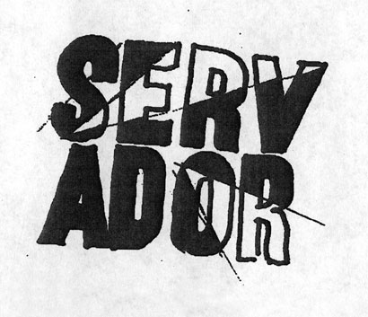
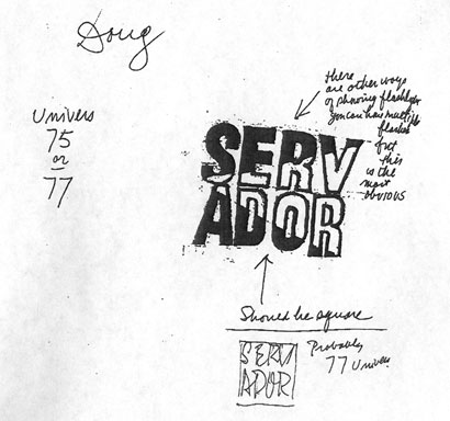
The goal for the logo was to have a single, bold expression that
would separate itself from its surroundings. Dozens of sketches were
created. Rand disliked the visual combination of letters in the very
name he created, so he broke the name into two lines. Usually when
creating a new identity with a new name it is critical to ensure the
legibility of the name. You are asking people to recognize a new brand
and sometimes even learn a new word. Make it legible and don’t make them
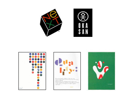
work too hard. Don’t break the word. Rand, an amazing visual
communicator, sometimes did play with legibility as seen in his logos
for NeXT, Okasan, as well as some of his posters and covers.
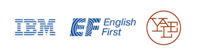
Rand strove to unite letters as well. He found unique graphic ways of
bringing together letters that happen to be sitting together in a word.
At that he was a master, as seen in his logos for IBM, EF and Yale
University Press.
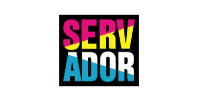
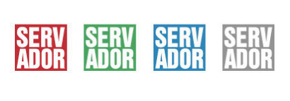
Paul Rand’s logo for Servador was simple and powerful. It was staged
inside a box for impact and Rand used a shining light for the purpose of
uniting the top and bottom letters. The use of Cyan, Magenta, Yellow,
and Black was an obvious nod to the printing industry. As part of the
original program, solid red, green, blue and gray versions were also
available for use.
Paul Rand passed away in November of 1996, shortly after the design
was completed. Servador is, possibly, Paul Rand’s final logo.
 Click on sketches for a larger image
Servador launched in 1999. From the Servador’s original website:
“Servador is an Internet-based, business-to-business print buying and
management company that saves corporations time, resources and money off
of their current print spend.”
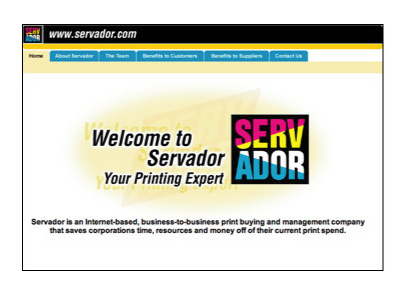
Eventually, to distance themselves from perception of the
old-technology printing industry, the all-blue version was adopted as
the primary logo for Servador. Even Paul Rand couldn’t escape
the secret power of the Blue Square.

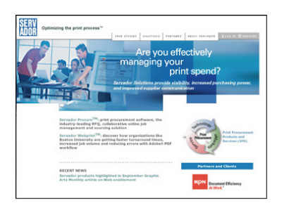
After a few years of success and partnerships with companies such as
Adobe, Servador found itself in troubled times. The faltering stock
market, 9/11, and increased competition all were taking their toll.
Adding to its capabilities by acquisition, Servador was also trying to
meet the demands of a changing business. In late 2002, a decision was
made to restructure and rebrand Servador. Doug Evans would also step
away from the company he built.
Doug Evans’ friend, and COO at the time, Mike Tardif was a printing
industry expert who had previously set up digitally based print
production departments at large advertising agencies. Tardif, given the
responsibility of leading the rebranding, brought in Mark Landry, a
former FutureBrand Creative Director, as the identity consultant. Mark
has designed identities for Bausch & Lomb, Dex Media, GM and
Tupperware as well as directing countless other identity and design
programs. Coincidentally, Mark also once collaborated with Paul Rand on a
project.
The name Printvision had already been chosen when Mark became
involved. The idea was about the future of workflow management for
printing needs.
From the PrintVision website: “PrintVision was founded as a print
technology company dedicated to bringing internal and external
visibility into print procurement. We do this by providing a software
platform with a suite of products to manage all of your print needs.
From desktop on-demand printing to a copy center, to the most complex
commercial print buying programs, PrintVision makes the job of printing
easier and cheaper.”
While Mark looked at many ways of expressing the idea, the final mark
was constructed of images that were inherent in the name. The revolving
paper symbolizes print management as it flows through an organization
while the overall shape is both an eye and a sun, speaking to vision and
vitality. Whether or not the undotted I’s are necessary, Landry has
managed to get a few relevant images into a single cohesive expression.


